August 15, 2026
Café Website Guide: Your Space's Feel, Online
Picture a backstreet café in Beyoğlu. Someone passing by glances through the window: is the light warm, are the tables comfortable, could I work here, could I talk here? The decision to walk in is made in three seconds, in that glance. The same thing happens online — with one difference: the customer looking through the window isn’t on the pavement, they’re on their phone. Your café website’s job is to fit the feel of your space into that three-second glance. Menu, location, hours — all important; but the feel comes first.
The feel of a place travels through photos
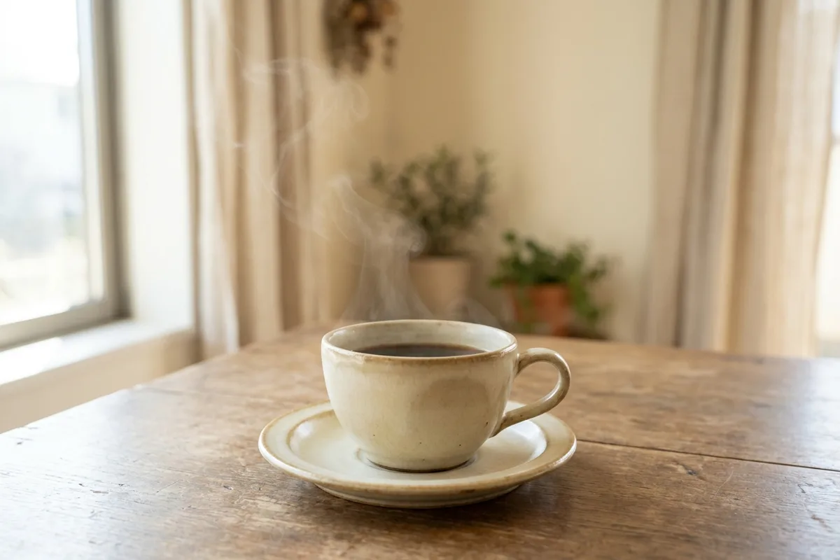
What makes people choose a café is usually the atmosphere, not the coffee. Put a photo at the top of your site that genuinely carries your space: midday light through the window, a wooden table, a steaming cup. Don’t use stock photos — when a customer walks in and can’t find the place from the picture, trust cracks at the door.
Five or six frames are enough: the room, one corner detail, the counter, two drinks, the garden if you have one. All shot with your own phone, in daylight. Change them with the seasons; a blanketed winter corner reads like a cool promise in July. Try a single sentence next to the photo, too: a concrete detail like "our back garden stays shaded and cool in July" convinces more than ten generic compliments.
Instagram is the shop window; the site is your address
Most cafés are already good at Instagram; the problem is that Instagram alone stays incomplete. A customer who taps your profile link and can’t find the menu, hours and location in one place gets lost. The right setup is a bridge: Instagram makes people discover you, the site makes them decide. The single link in your bio should lead to your site; your site should have a visible door back to your Instagram. We argued at length why neither works alone in our Instagram and website post. The measure of the bridge is simple: everything that looks good on Instagram should find its answer on the site — the cake in the photo should have a name and a price on your menu.
Menu and prices: no surprises
Café menus are short; keep them short on the site too. Coffees, a few dishes, with prices — all on one page, readable by scrolling on a phone. Don’t shy away from prices: the customers who never walk in wondering "is it expensive?" far outnumber the ones who saw the price, found it fit their budget, and came. Your menu page is also the very content that lifts you in searches like "breakfast in Beyoğlu" — one more reason to build it as a page rather than a PDF.
Being found: map, hours, neighborhood
How does the student searching "café to work in Beyoğlu" find you? Your neighborhood should appear in your page title, your Google Business Profile should state the same address and hours as your site, and the map should open in one tap. Be honest about opening hours; greeting a customer with "we’re closing" half an hour before the posted time is the shortest road to a two-star review. If you have desks with sockets or a quiet floor, say so — the working customer is looking for exactly that.
Do you need an e-commerce module?
The honest answer: a café doesn’t need e-commerce. Selling beans means shipping, stock and returns — a separate business that steals energy from your real one. Before adding a cart, ask: how many people a week actually ask "could you pack and ship the beans?" If the answer is obvious, taking orders over WhatsApp is plenty. You can’t tend a cart’s payments and returns while standing at the espresso machine; let the café’s site serve the café.
The rest you already know
The page skeleton is the same as every small business: the layout in our five pages guide holds for cafés too. To see how it can look, two of our café templates are live: Köz Kahve and Zar Fincan.
If you’d like the feel of your space carried online, get a free quote — from the photo language to the menu, let’s build it together.